Old Logo Used
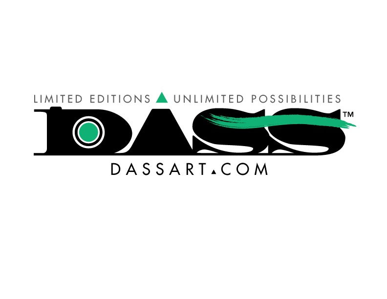
New Logo Created
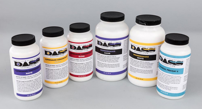
Family Shot New Labels
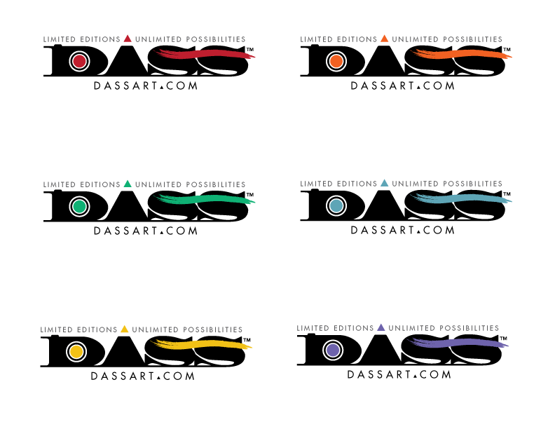
Family Logos Created for Each Product
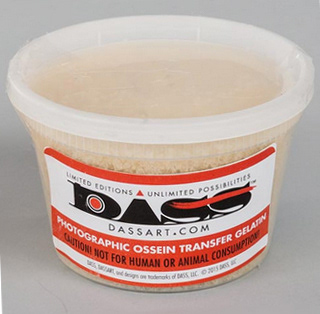
Container Label
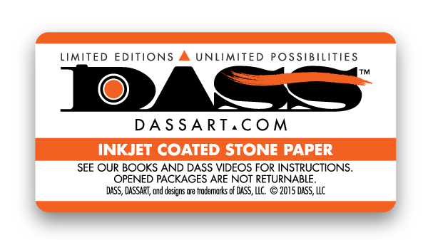
Container Label
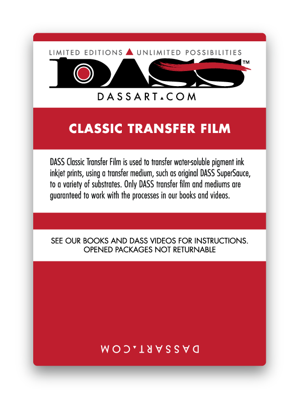
Box Label
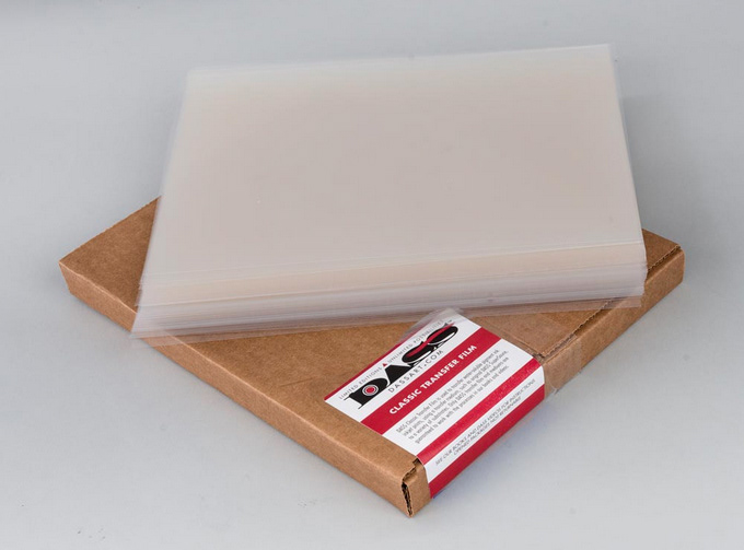
Box Label
Client: Digital Art Studio Seminars (DASS)
DASS needed a rebranding for a family of products. The previous design did not work well with packaging needs. A new mark was needed to incorporate a relationship to the primary product, SUPERSAUCE®, that allows for digital art transfers to a wide variety of substrates for artists and photographers. Client had a desire to have a newer vintage or retro look. A representation of cameras and photography was inspiration for the final mark. The original logo had a chemical symbol that represented the "A" for Alchemy in DASS. Because the key ingredients rely heavily on their chemical build-up, the desire to maintain this symbology was important to the client. The new slogan (also developed by CreativeJake) needed to be incorporated. Lastly, the logo needed to have some ability to be represented with different colors for the many different types of papers, transparency films, and chemical products without appearing too "craftsy" or "pastelly".
Adobe Illustrator

