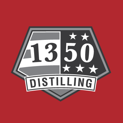
Primary "red" logo
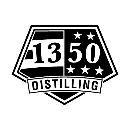
Secondary logo
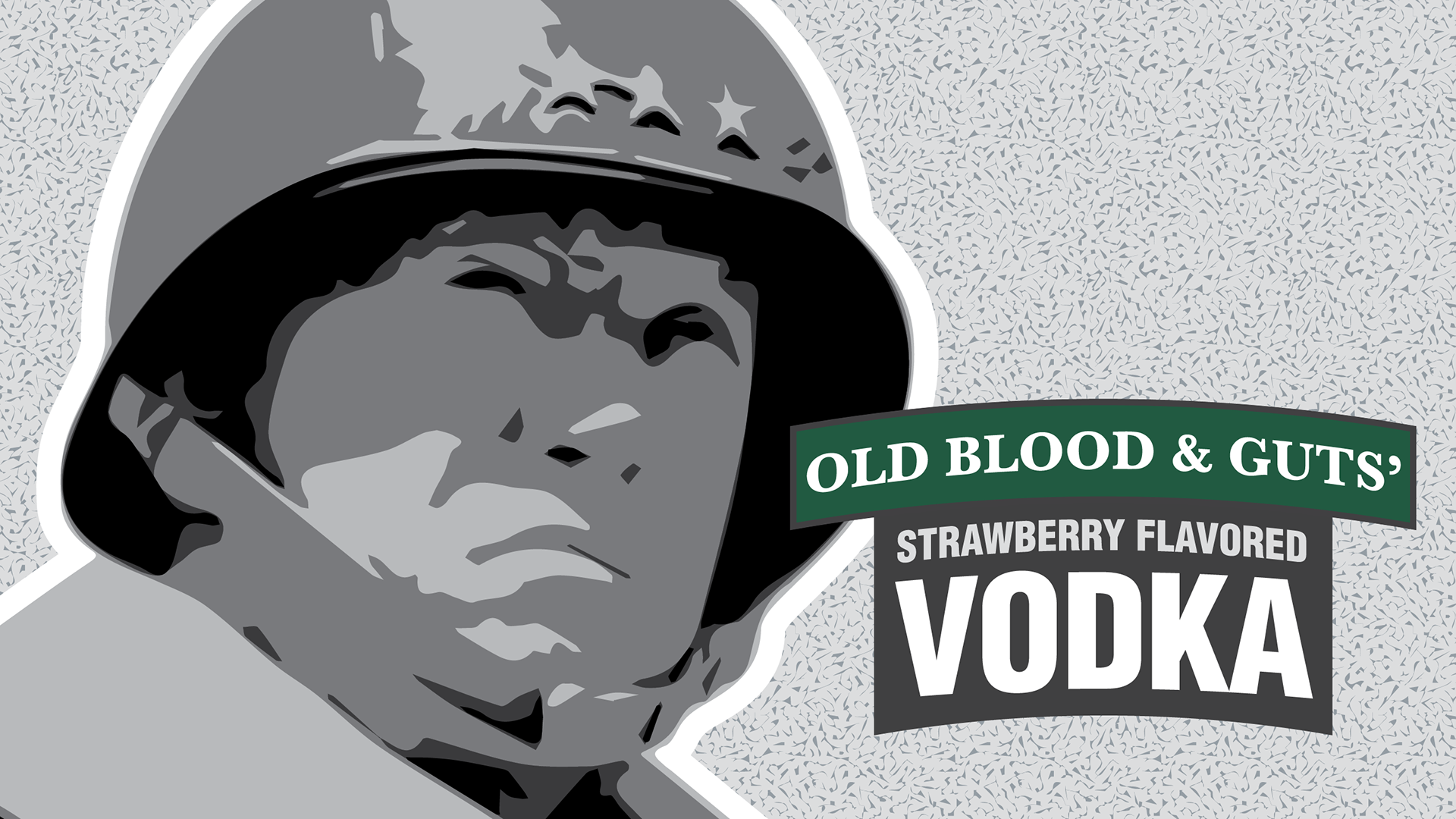
Name of craft distillery in Colorado Springs, Colorado is derived from the 13 stripes and 50 stars of the United States of America's flag. They are veteran, teacher, and women-owned. Each spirit product is dedicated to a different branch of military or first responder.
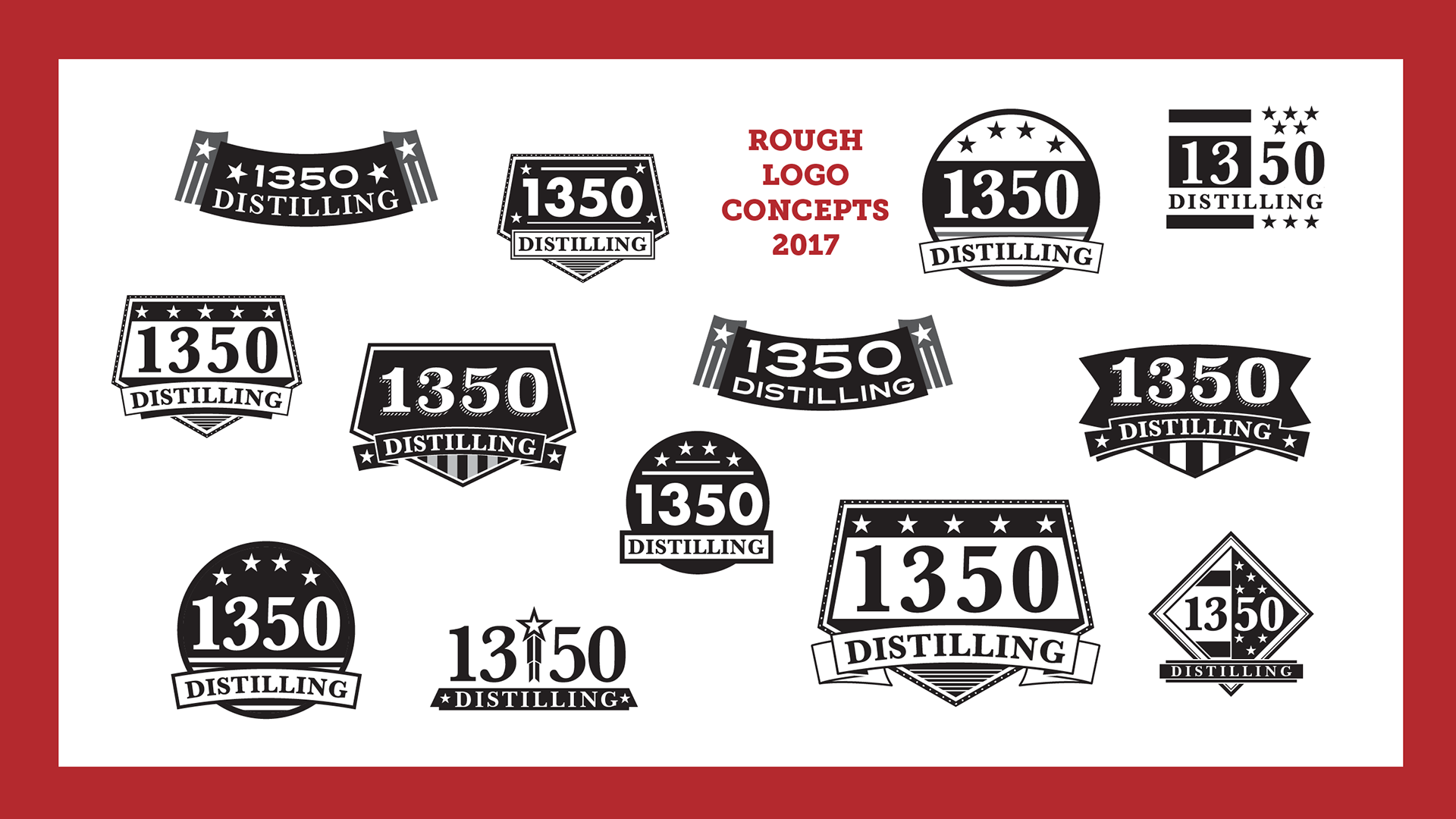
Not being able to trademark the American flag, our focus for the logo mark was to create something distinct in shape, authoritative, and memorable. The pentagonal outer shape with a rocker arm across the lower half helped to achieve a symmetrical balance, while maintaining the stripes and stars' reference to the flag symbols. The primary mark needed to be black and white because of the intent for it accompanying each spirit label whose color would represent the different branches of military.
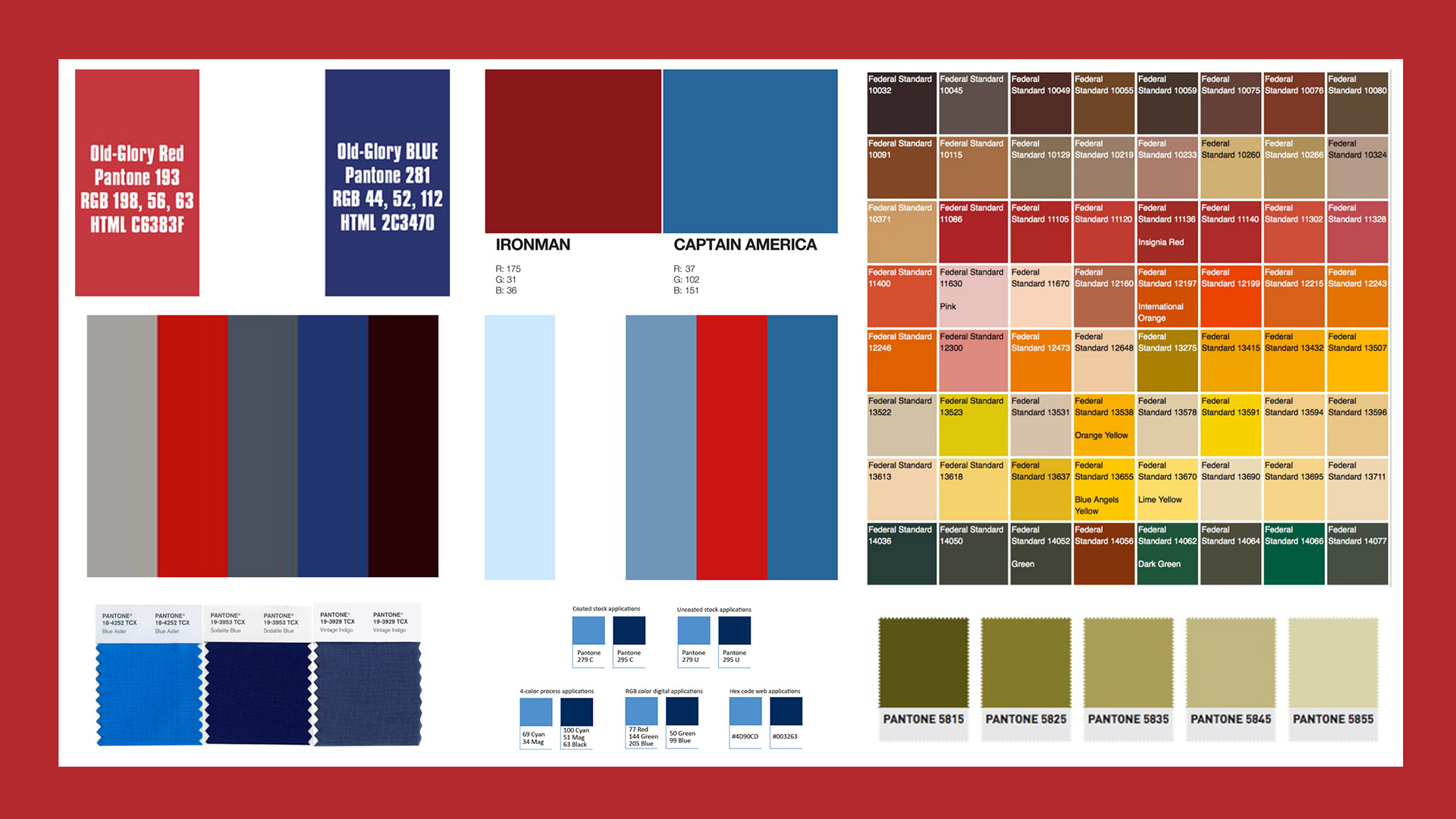
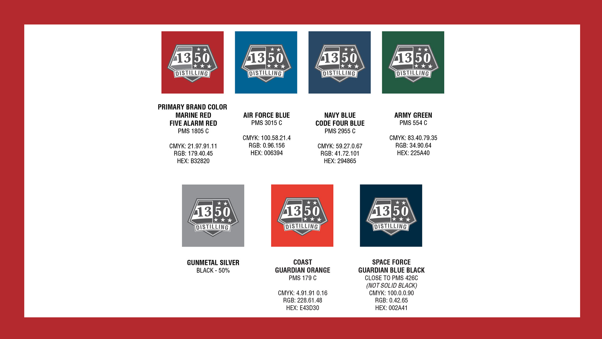
For the primary color version of the mark, our color research for the distilled spirit industry indicated that the use of a single color, other than black, gold, or silver would stand out against the competition. The veteran owner of the distillery is a retired U.S. Marine, and the red chosen matches both Old Glory's and the U.S.M.C.'s red.
Logo, Servicemen, and Bottle Concepts
Collaborative design processes between the logo development, imagery wanted for the "servicemen" or individual artwork for each spirit, and the bottle labels progressed concurrently during the design process.
Research collected many official colors for official U.S. military uniforms, flags, and yes, even comic book heroes to find the right set that could work together on finished bottles. Colors were chosen based on the branch of service.
Package design process
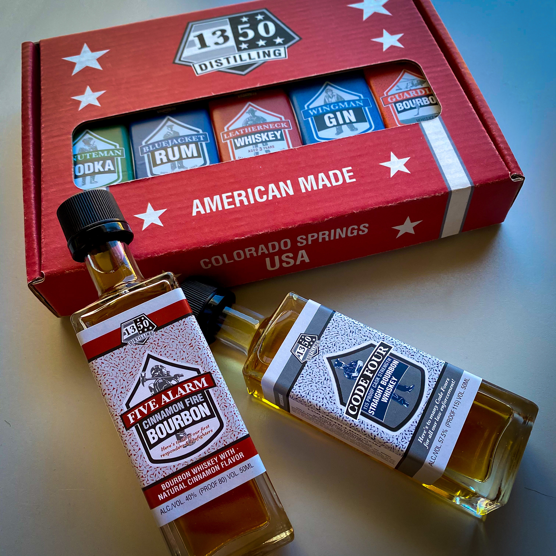
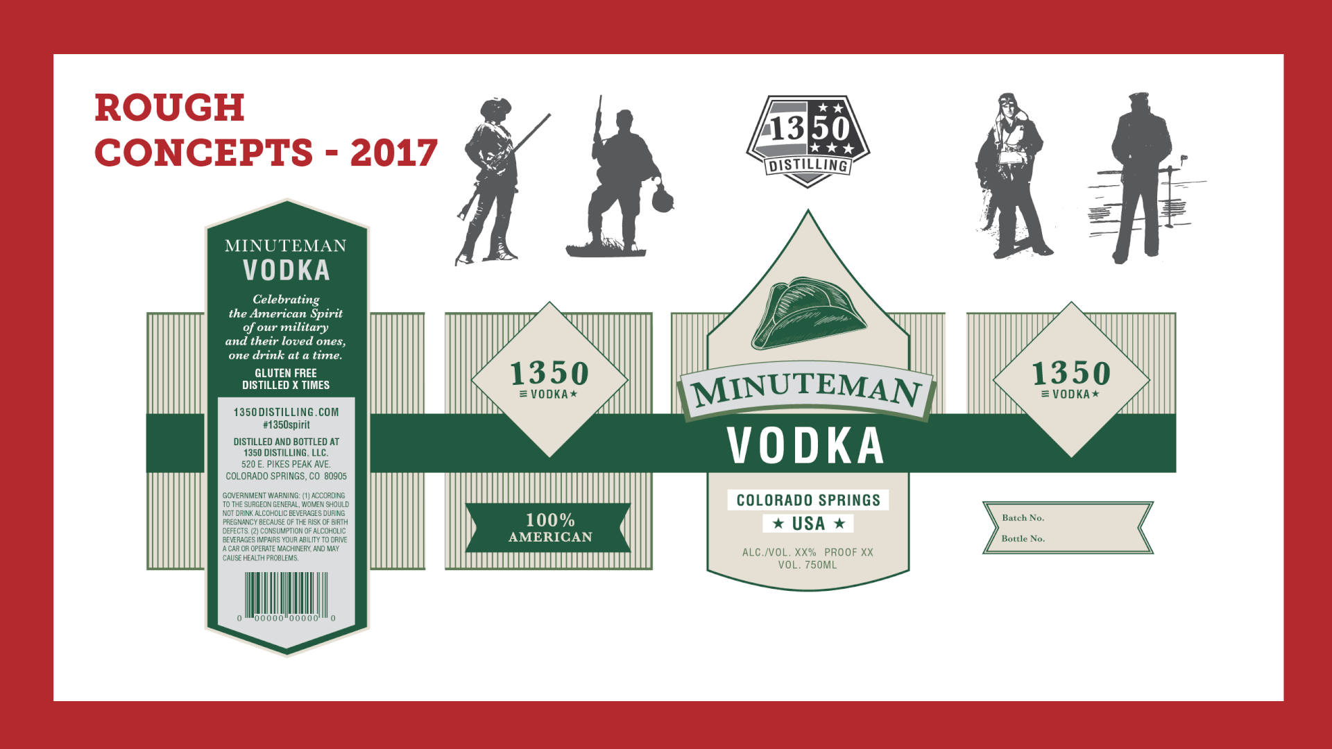
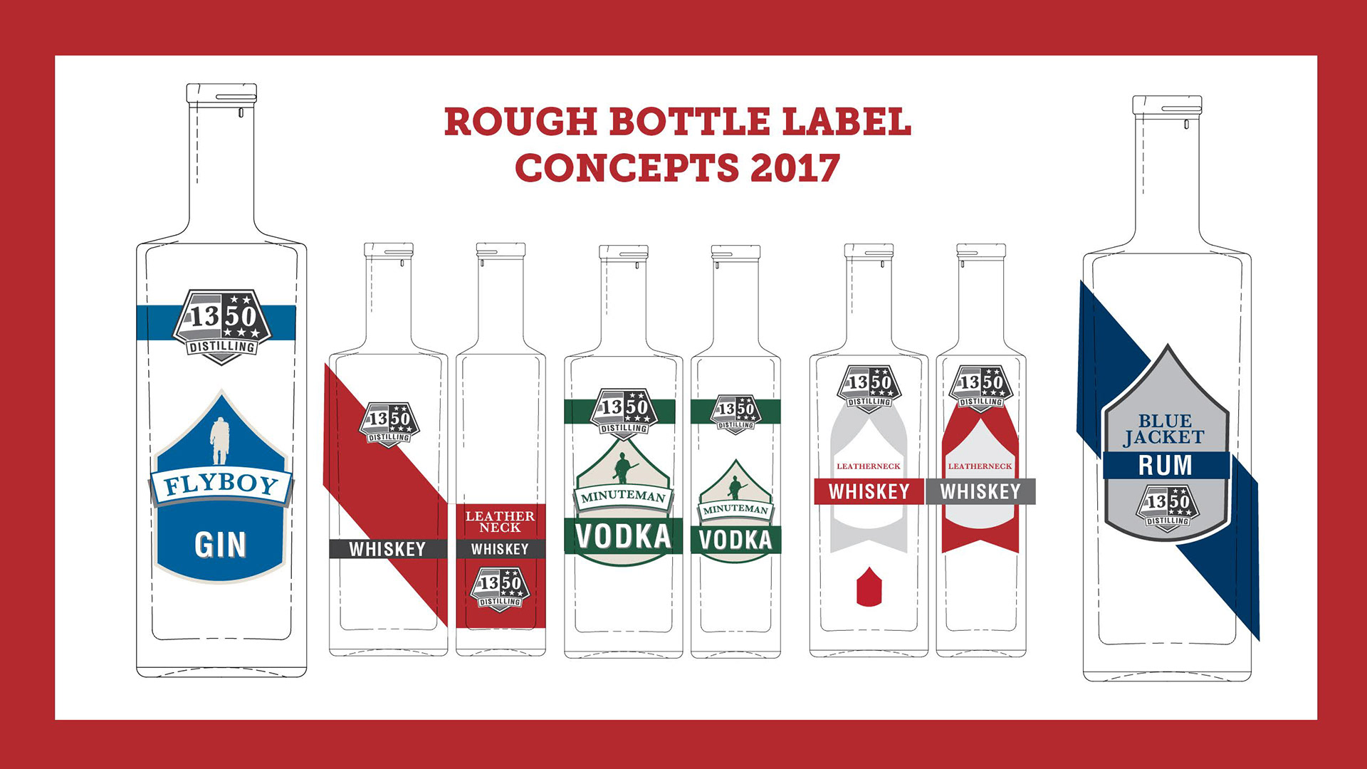
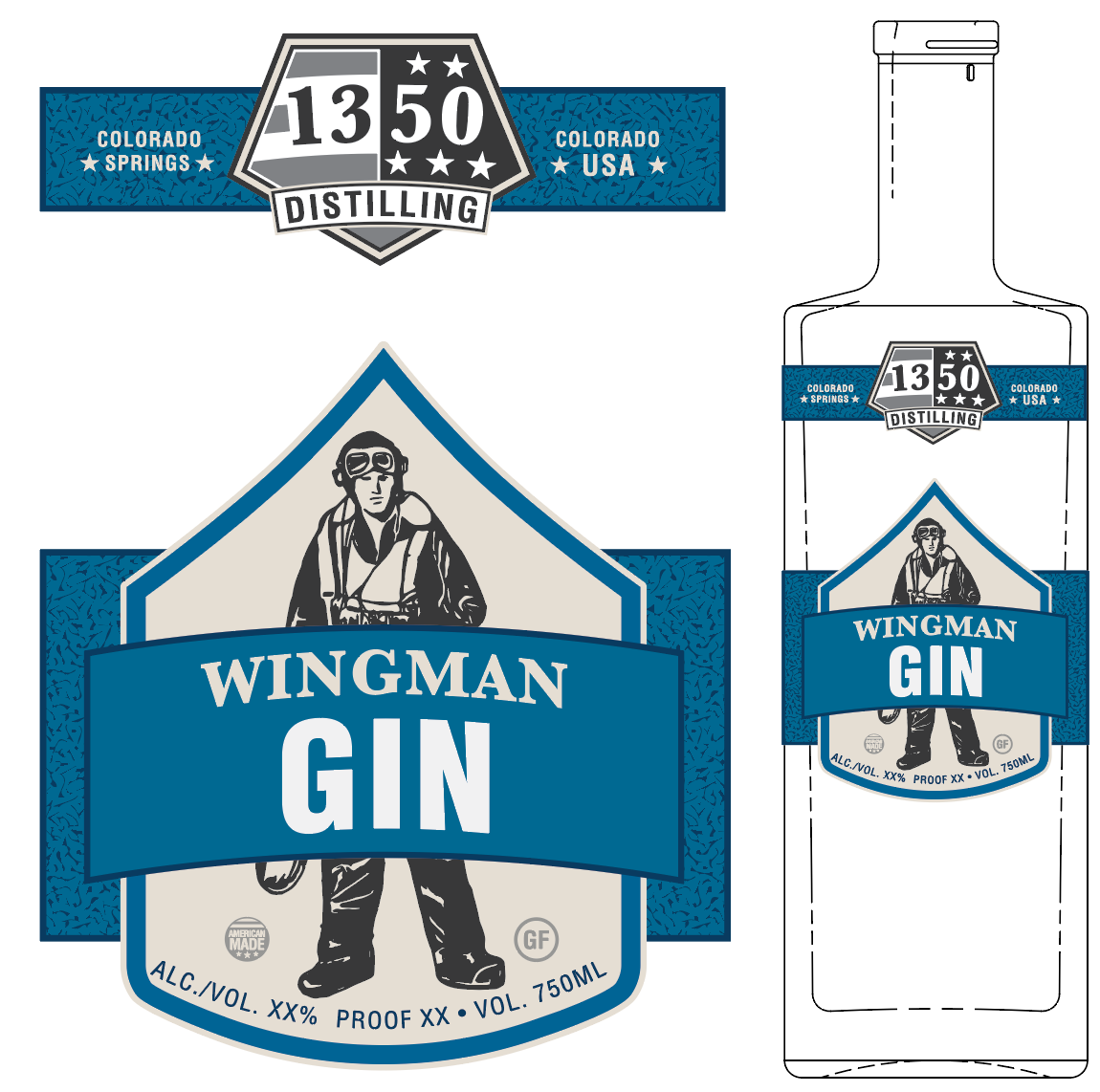
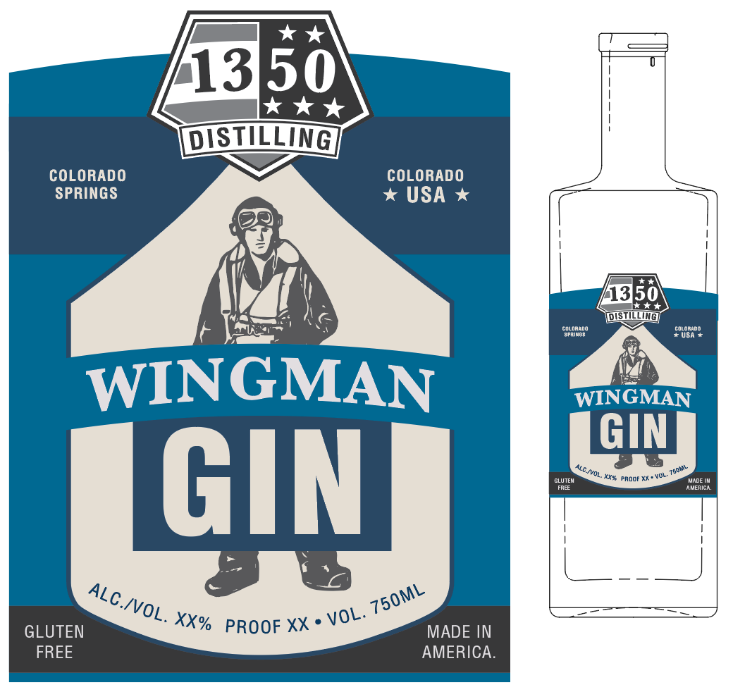
The "Liberty" bottle design was chosen, along with the spirit brand names and general imagery. A single-colored illustrative individual, or "serviceman" would represent each branch and spirit. Spirit type needed to be largest readable type with the spirit brand secondary. The grayscale 1350 Distilling logo needed to remain in same location for each product. Often in the spirit industry, the manufacturer's name is the name of the product. In this case, 1350 Distilling is the manufacturer, but each spirit is intended to stand alone. Design assisted by market testing with family and friends.
Finished bottle design
Two parallel labels are applied by hand at the same time wrapping completely around the square "Liberty" bottle. Each color is representative of the military branch or first responder coloring, topped off with matching hand-dipped wax.
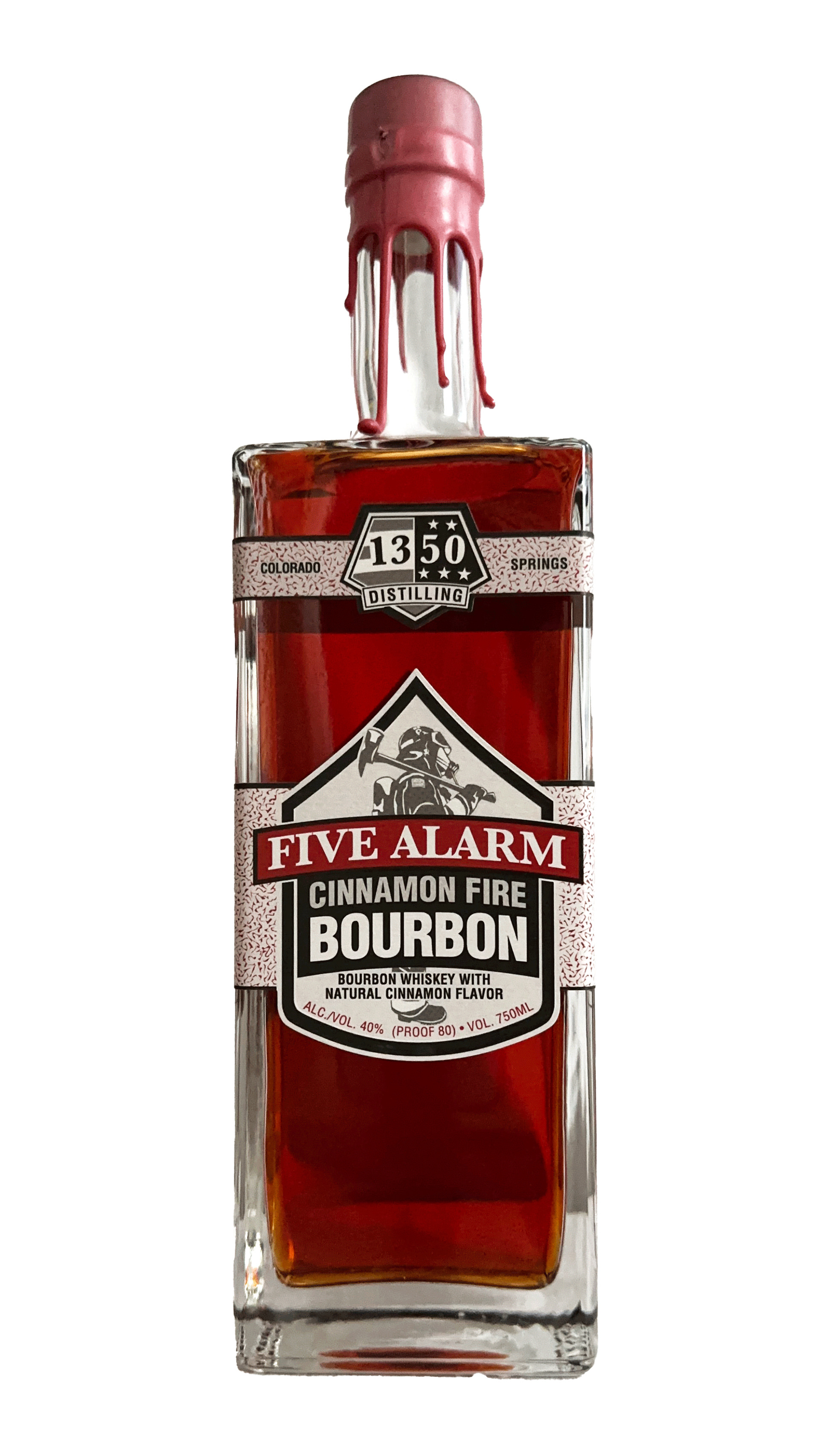
Five Alarm Cinnamon Fire Bourbon
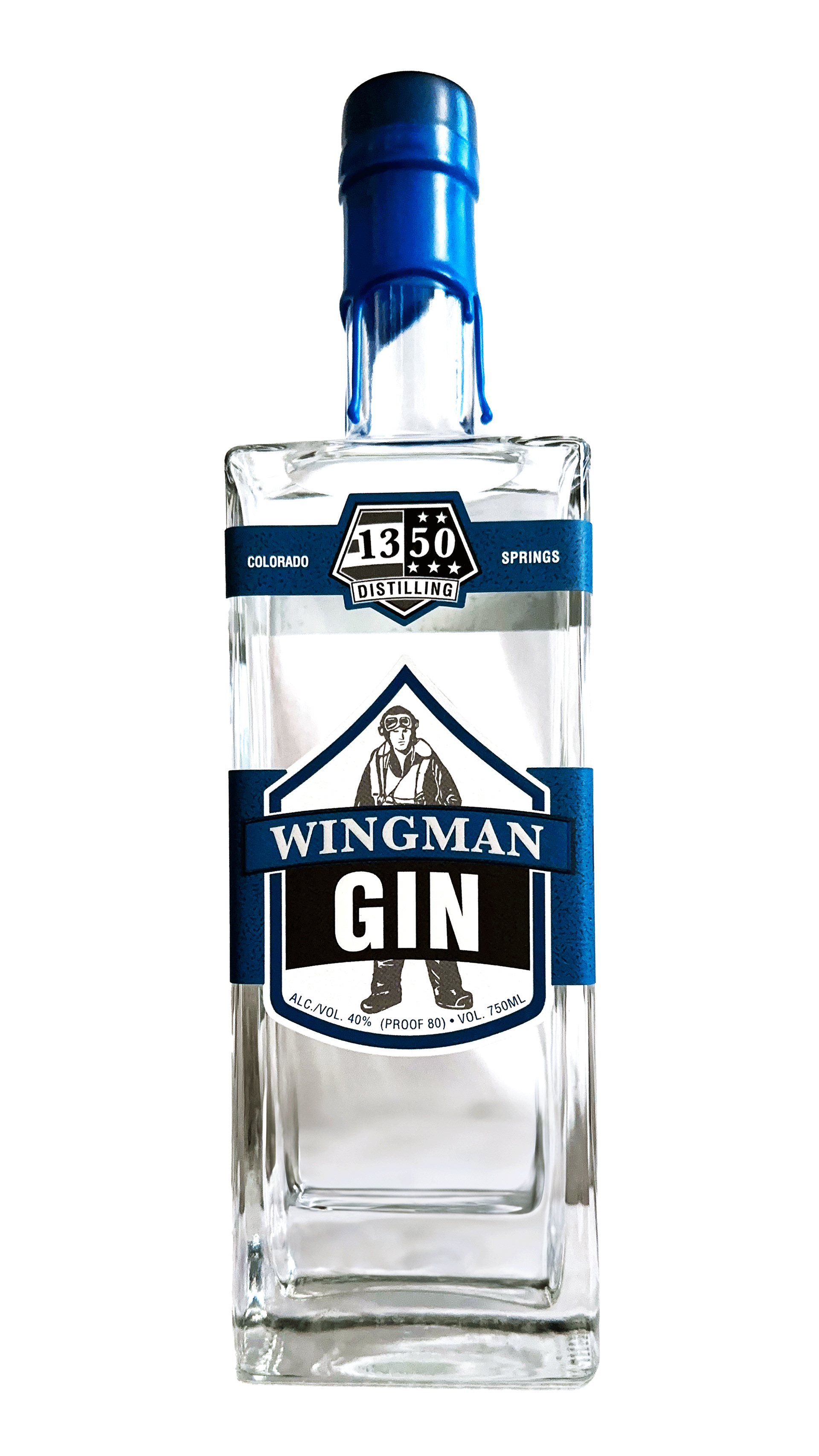
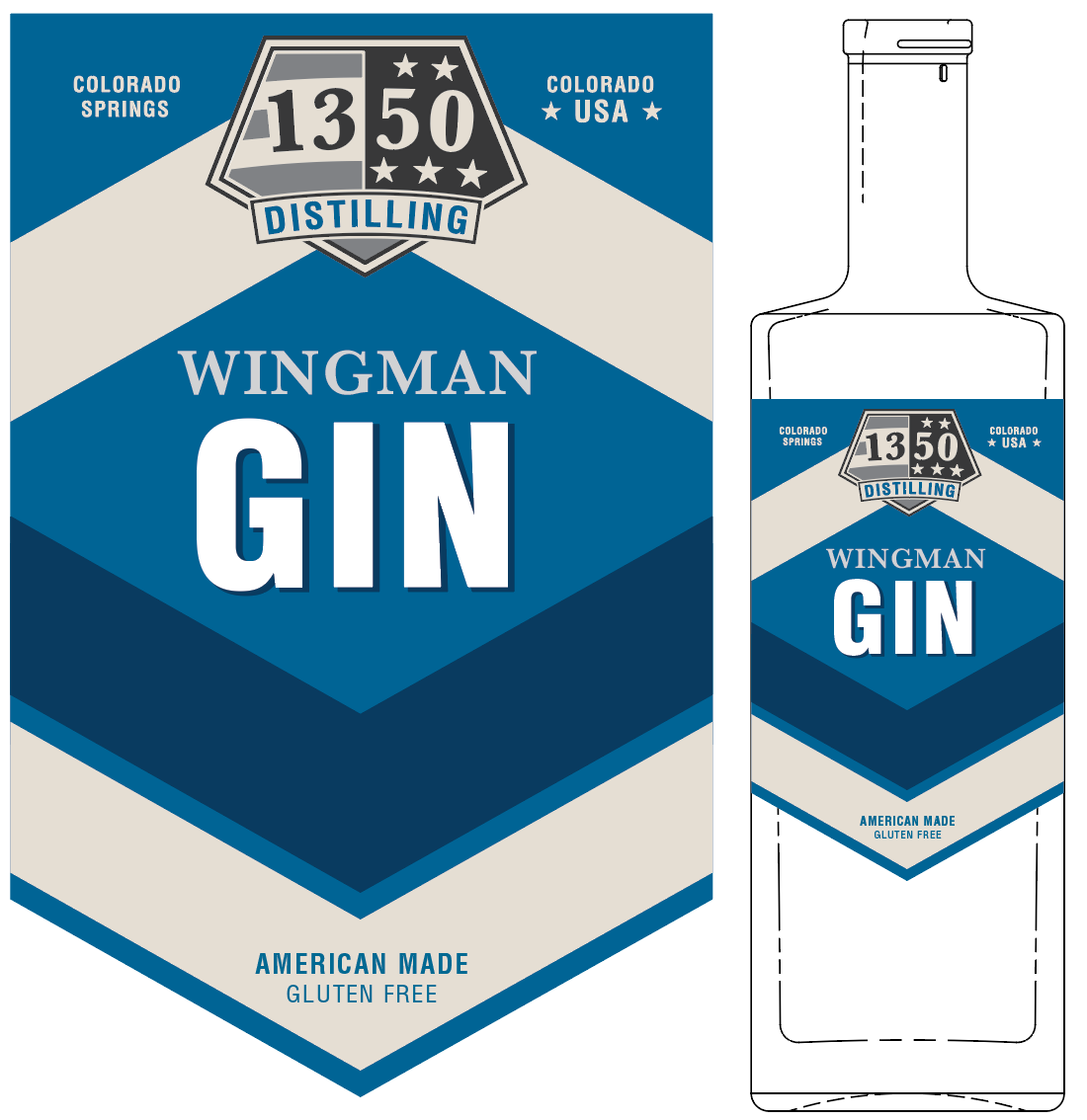
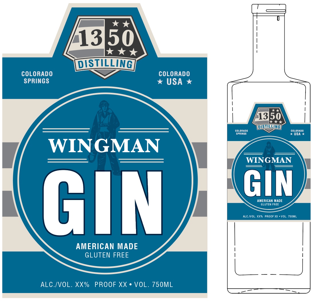
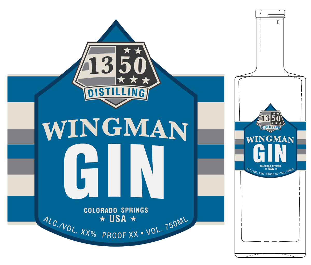
Wingman Gin
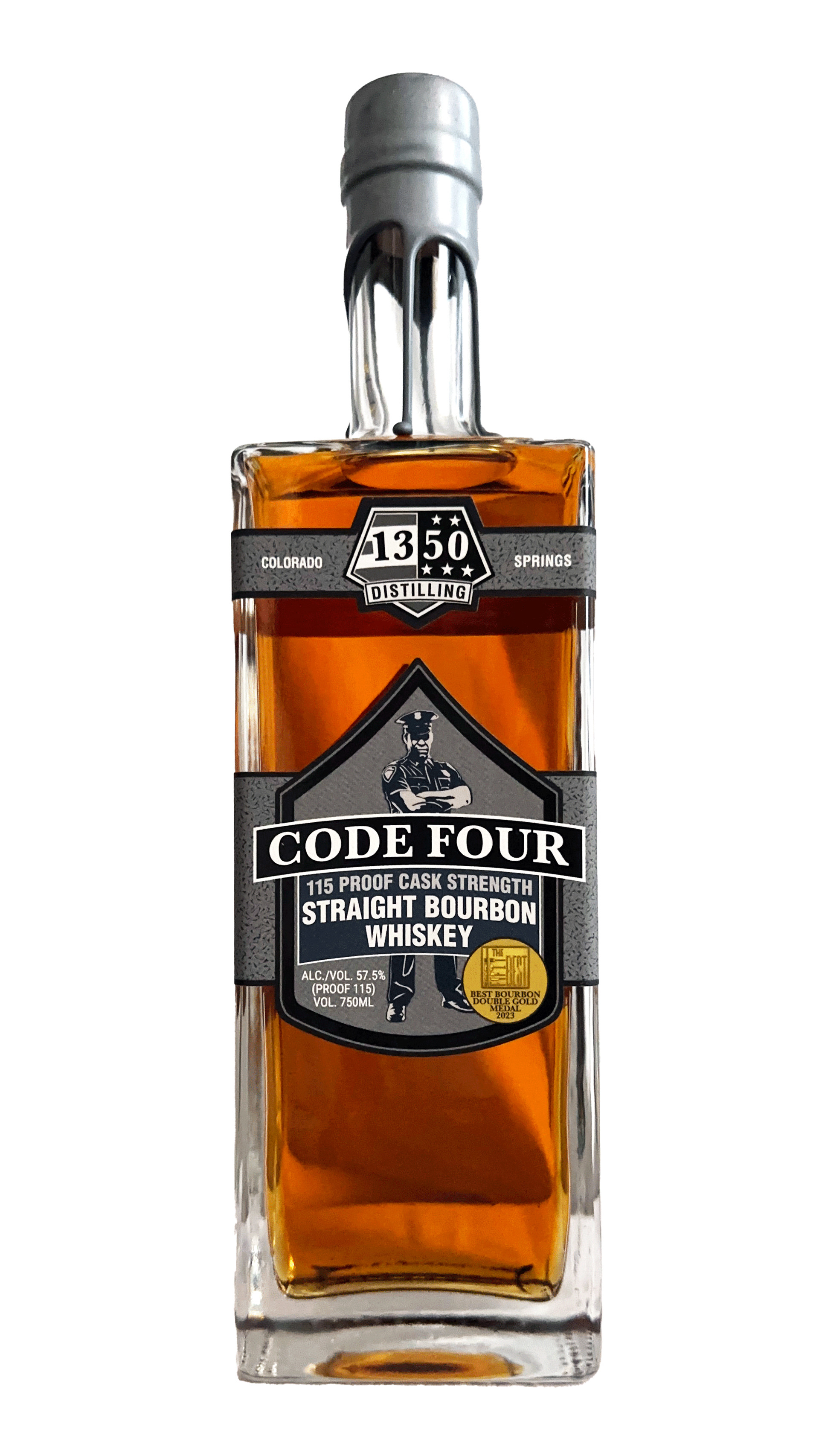
Code Four Cask Strength Bourbon
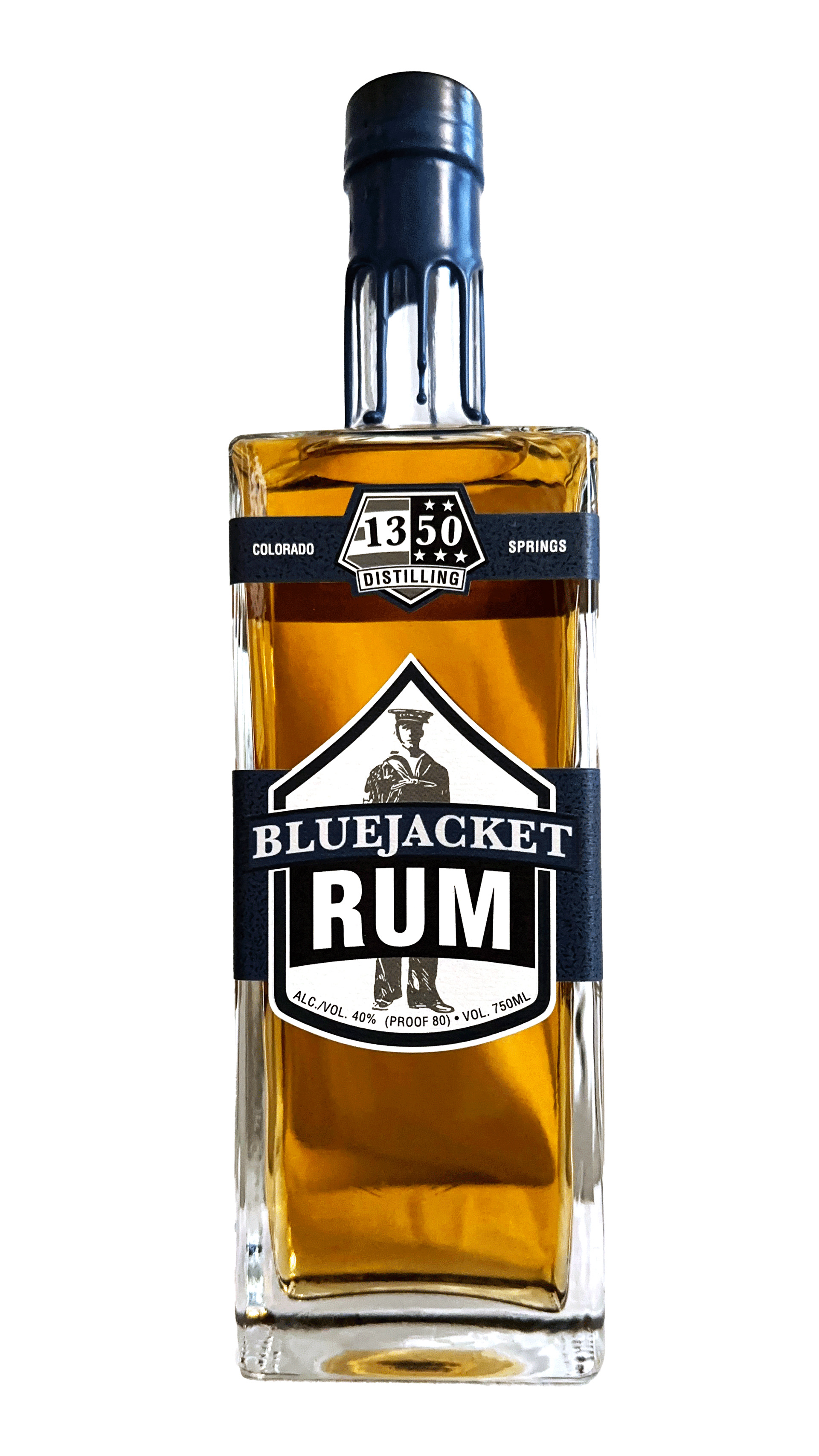
Blue Jacket Rum
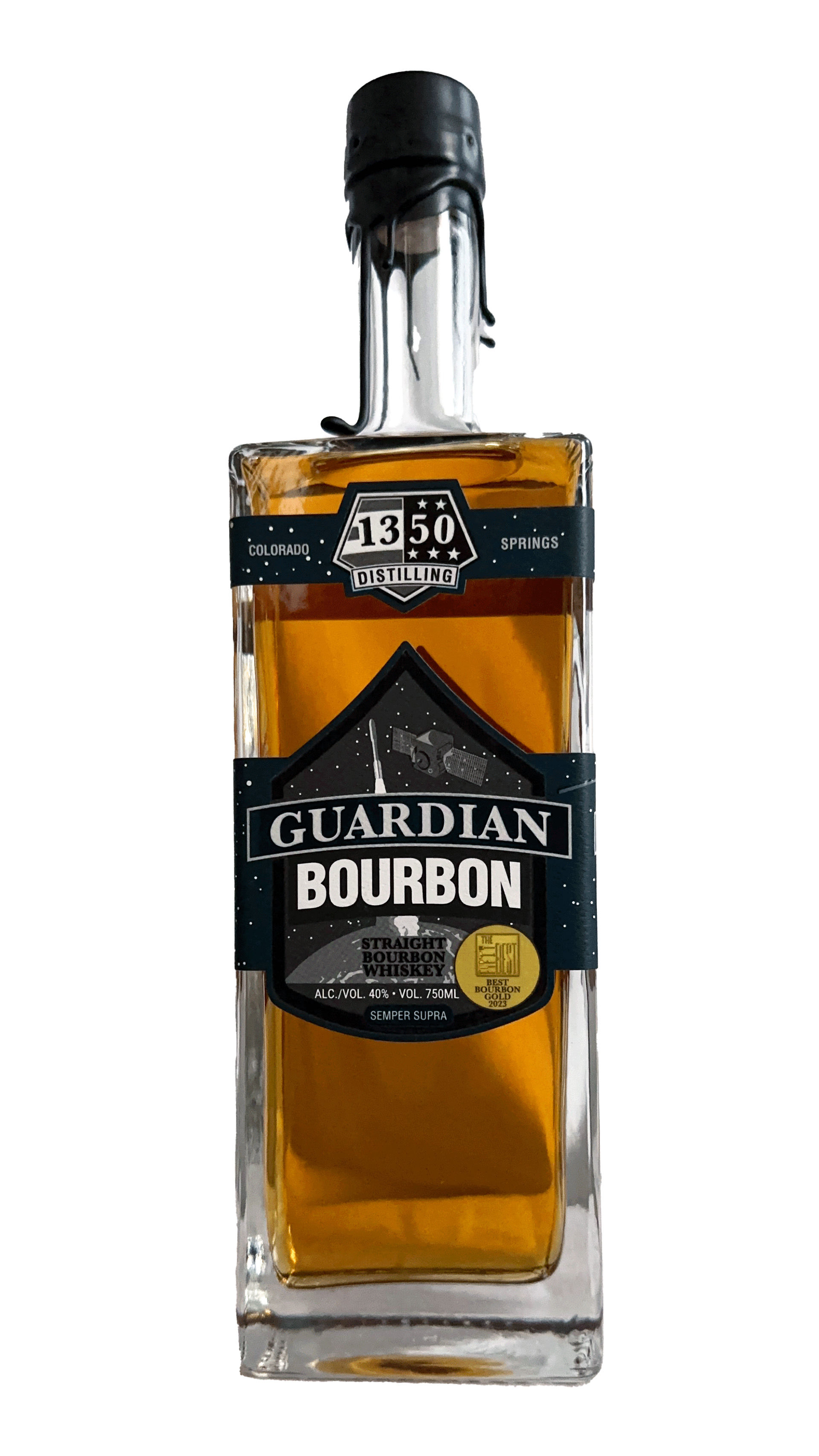
Guardian Bourbon
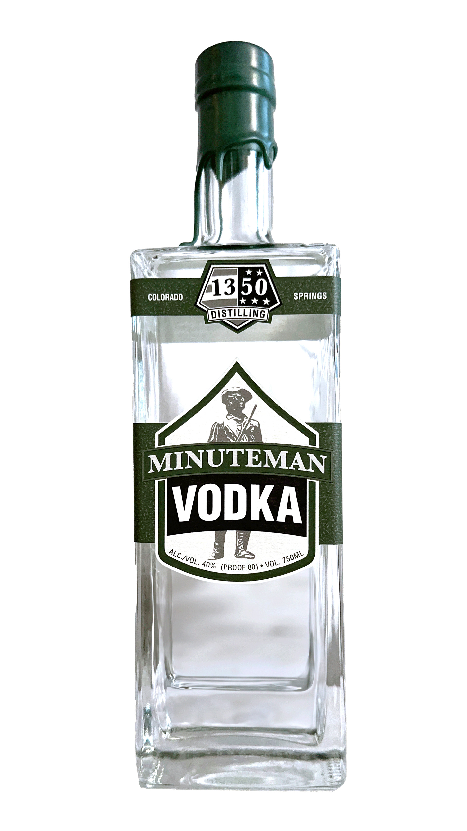
Minuteman Vodka
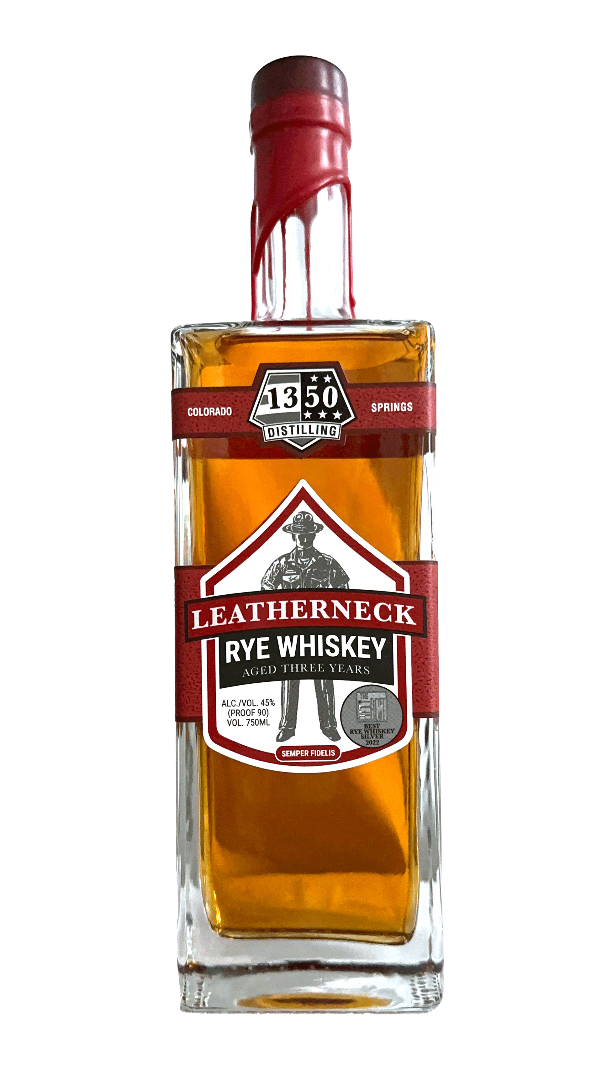
Leatherneck Rye Whiskey
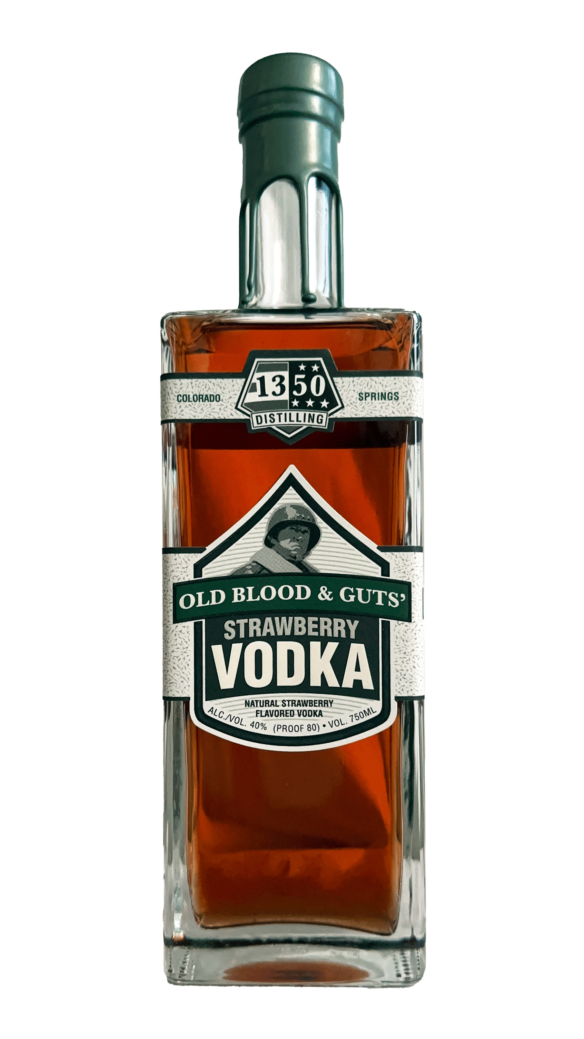
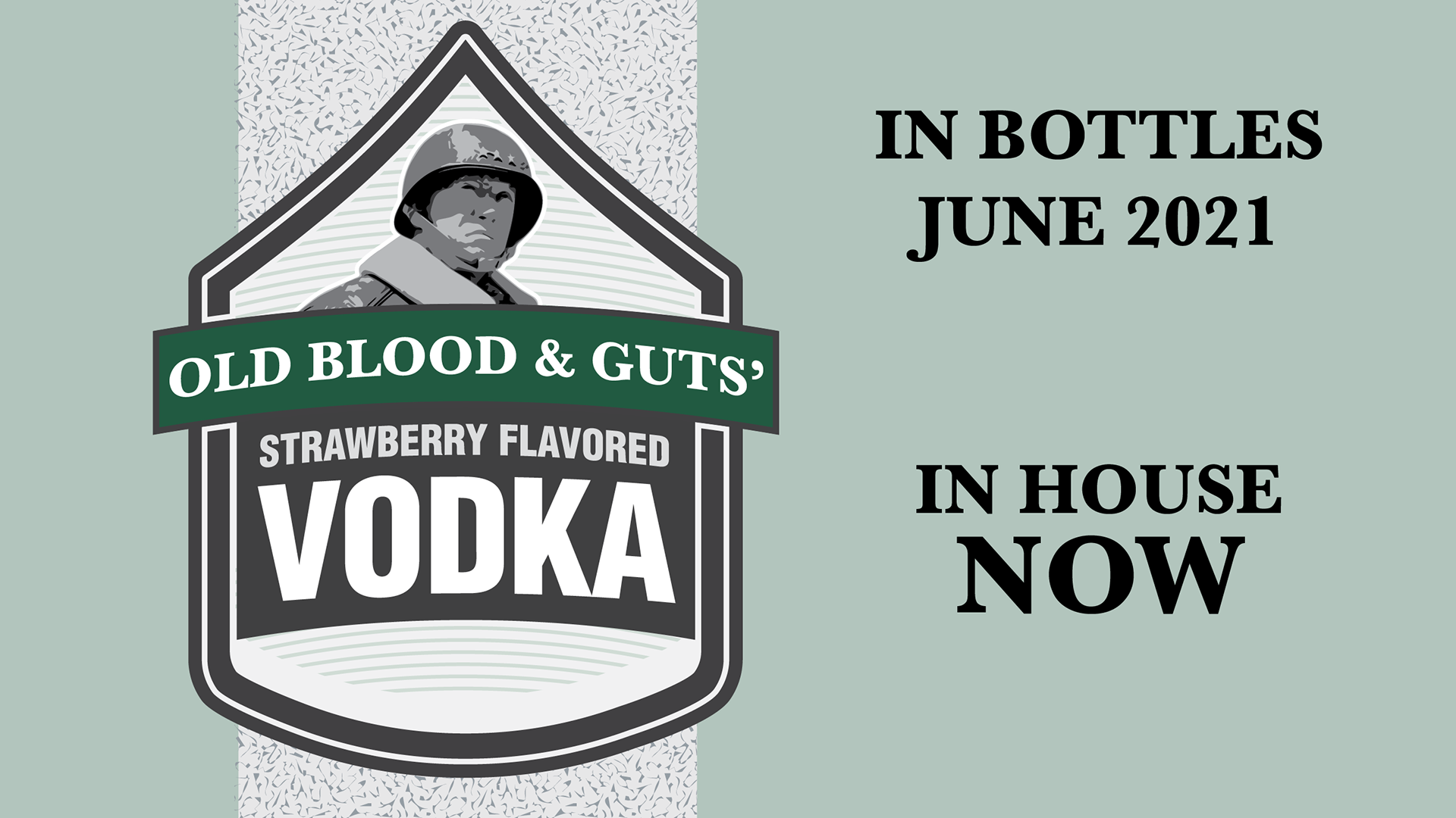
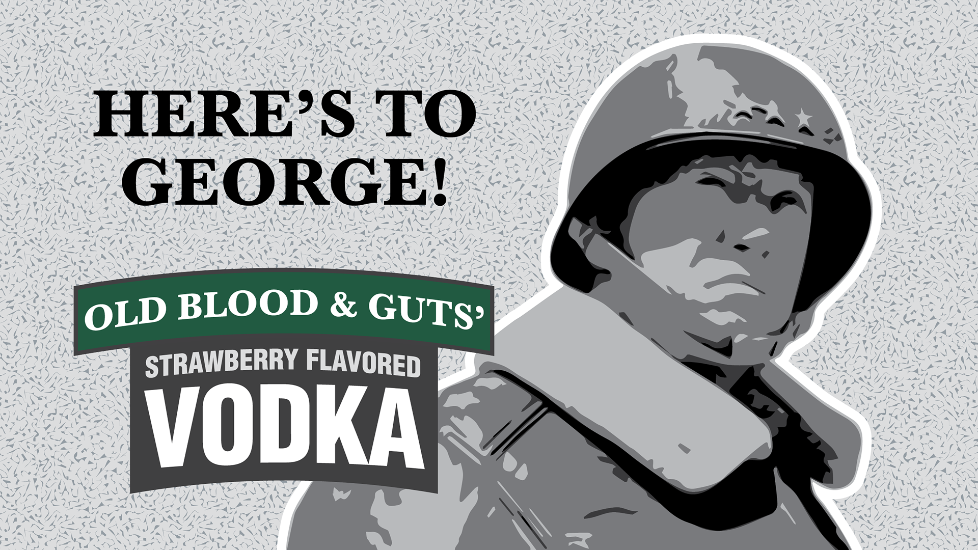
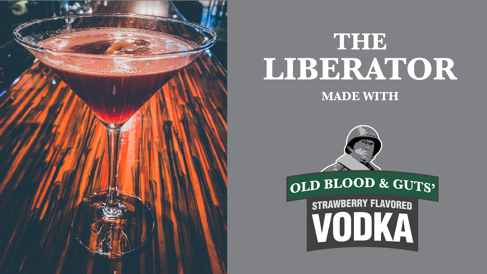
Old Blood & Guts' Strawberry Vodka
Signage
The "rocker arm" from primary logo is brand a symbol, as well as the five point U.S. star and stripes. These are used throughout marketing and advertising materials. The chevron shape is the brand's primary shape for bottle labels that is used for other signage within the Taste Lounge of the distillery.
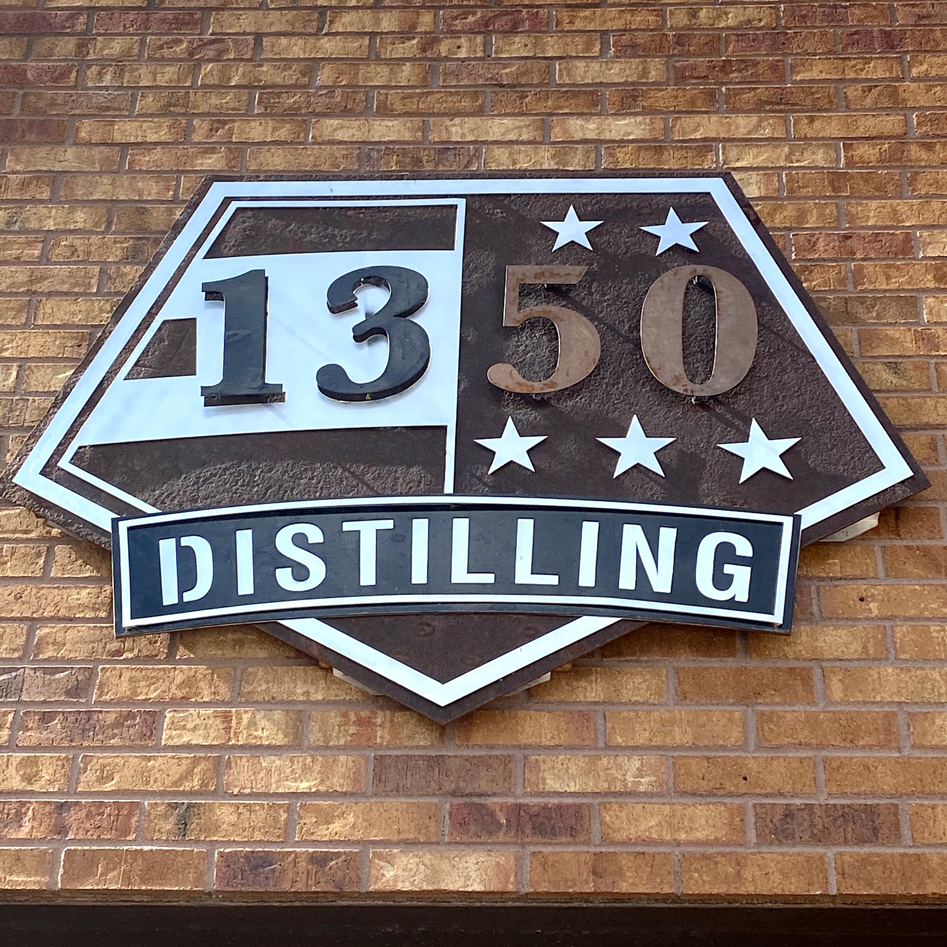
Metal Steel Layered Sign 4' x 3'
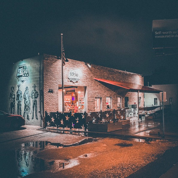
Taste Lounge Exterior
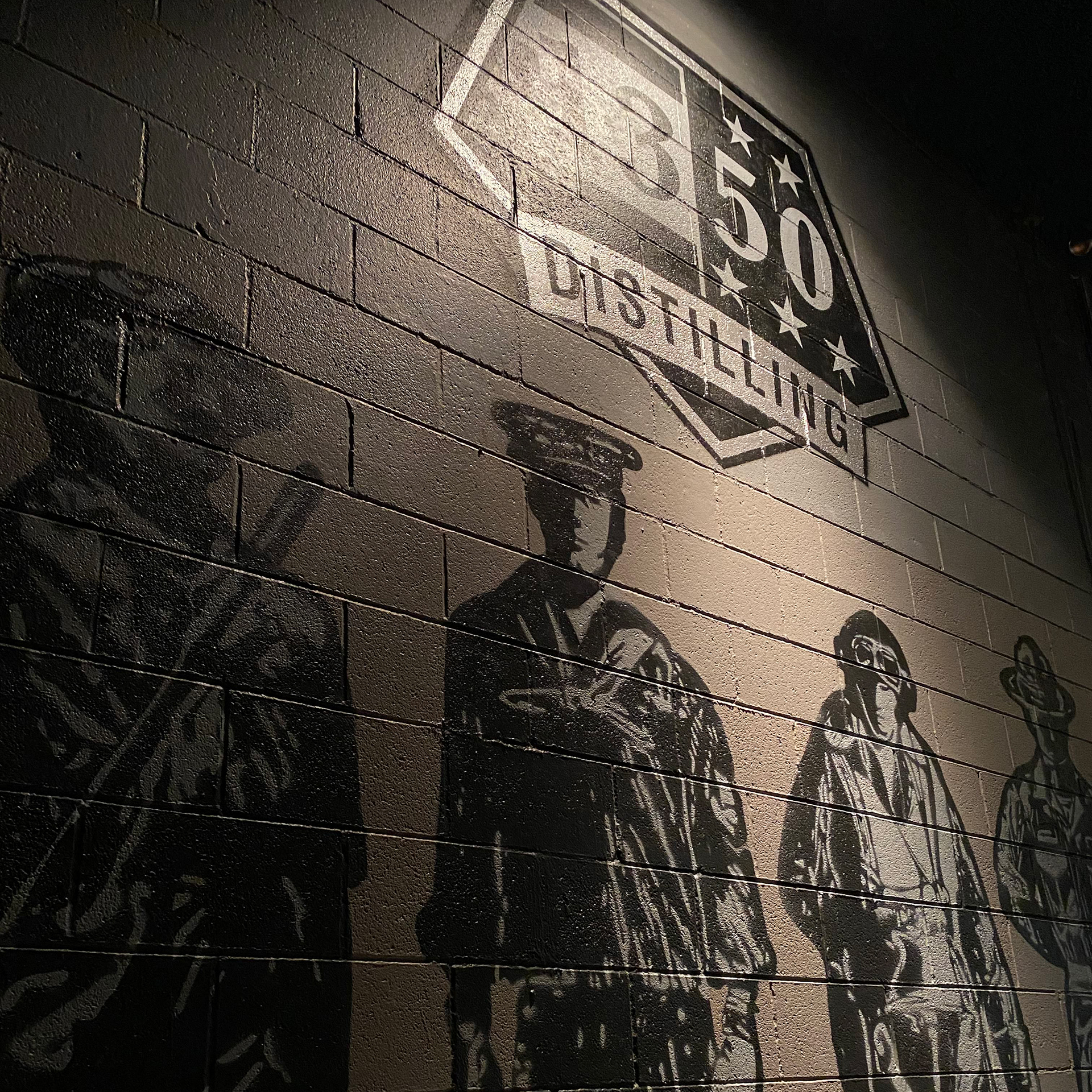
Painted Mural and Logo
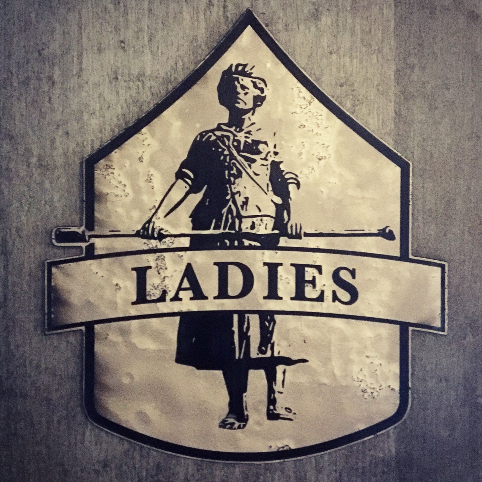
Restroom Signage
Television slides
In-house advertising television slides used to promote new products, news, events, and cocktail offerings.
Imagery
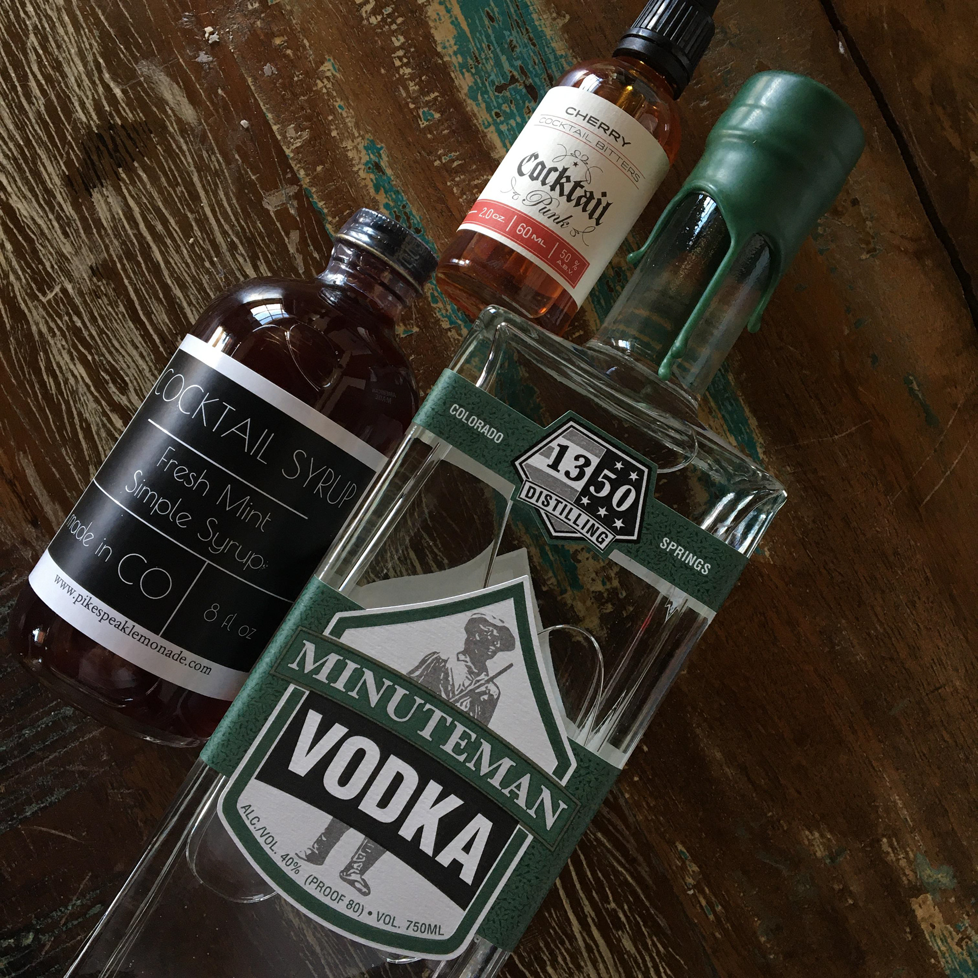
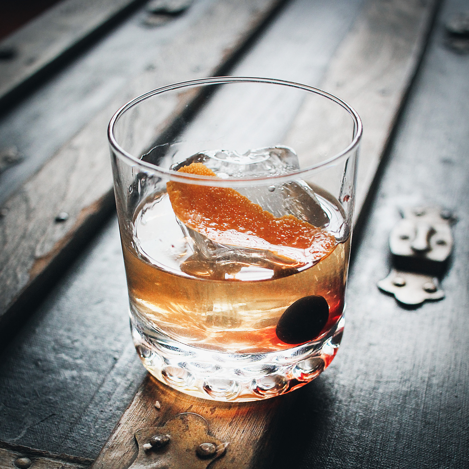
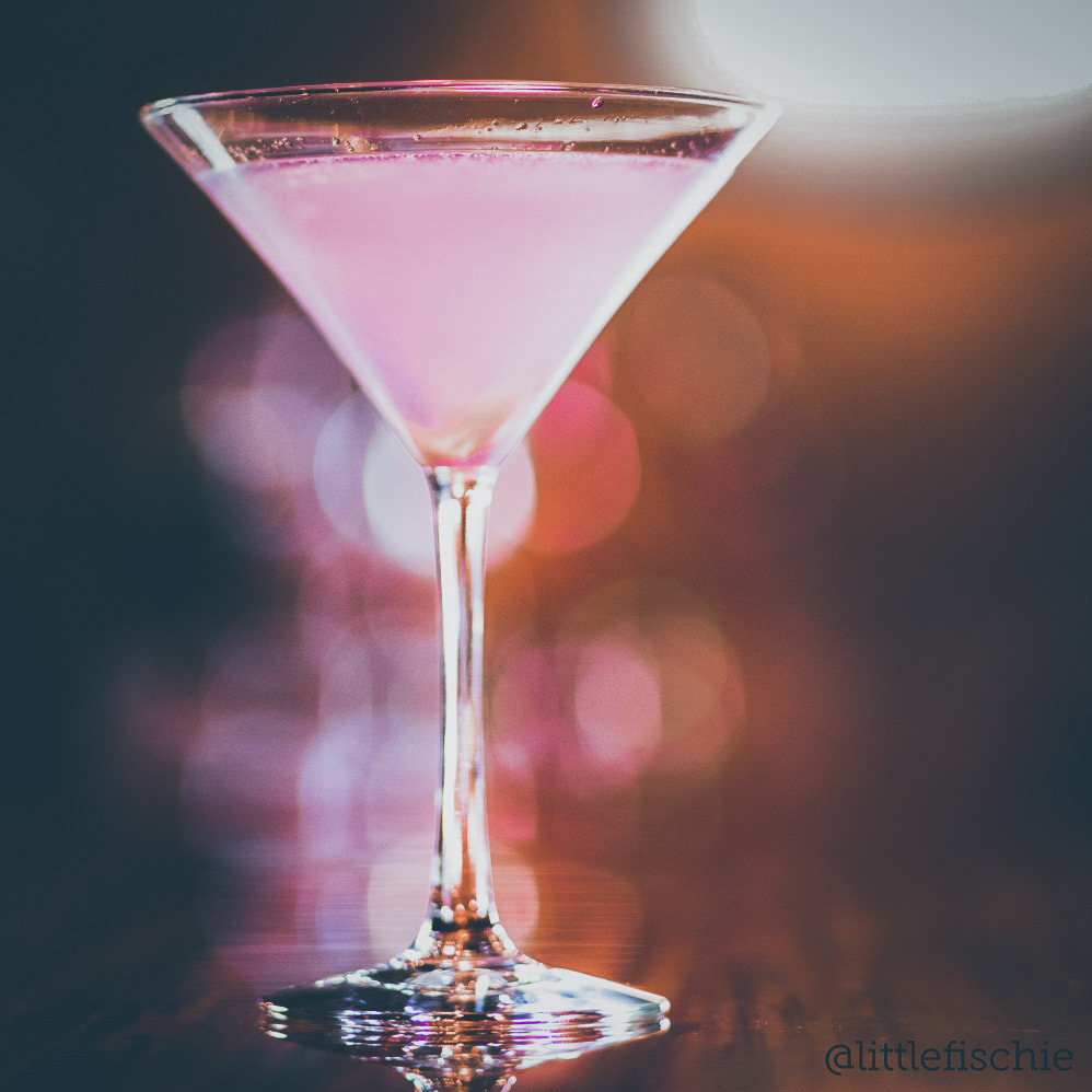
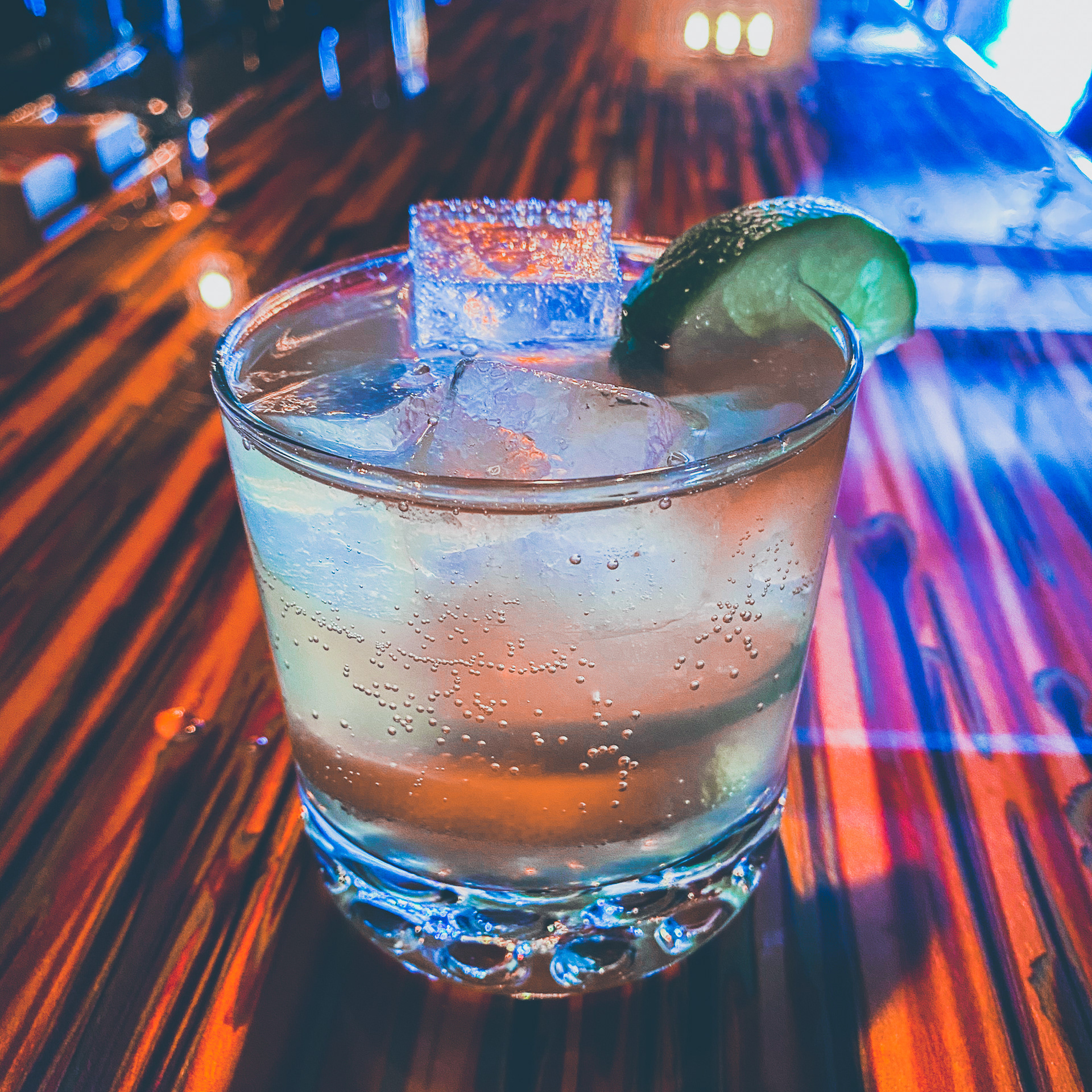
Photography has a strong contrast with and use of perspective to make the cocktail enticing.
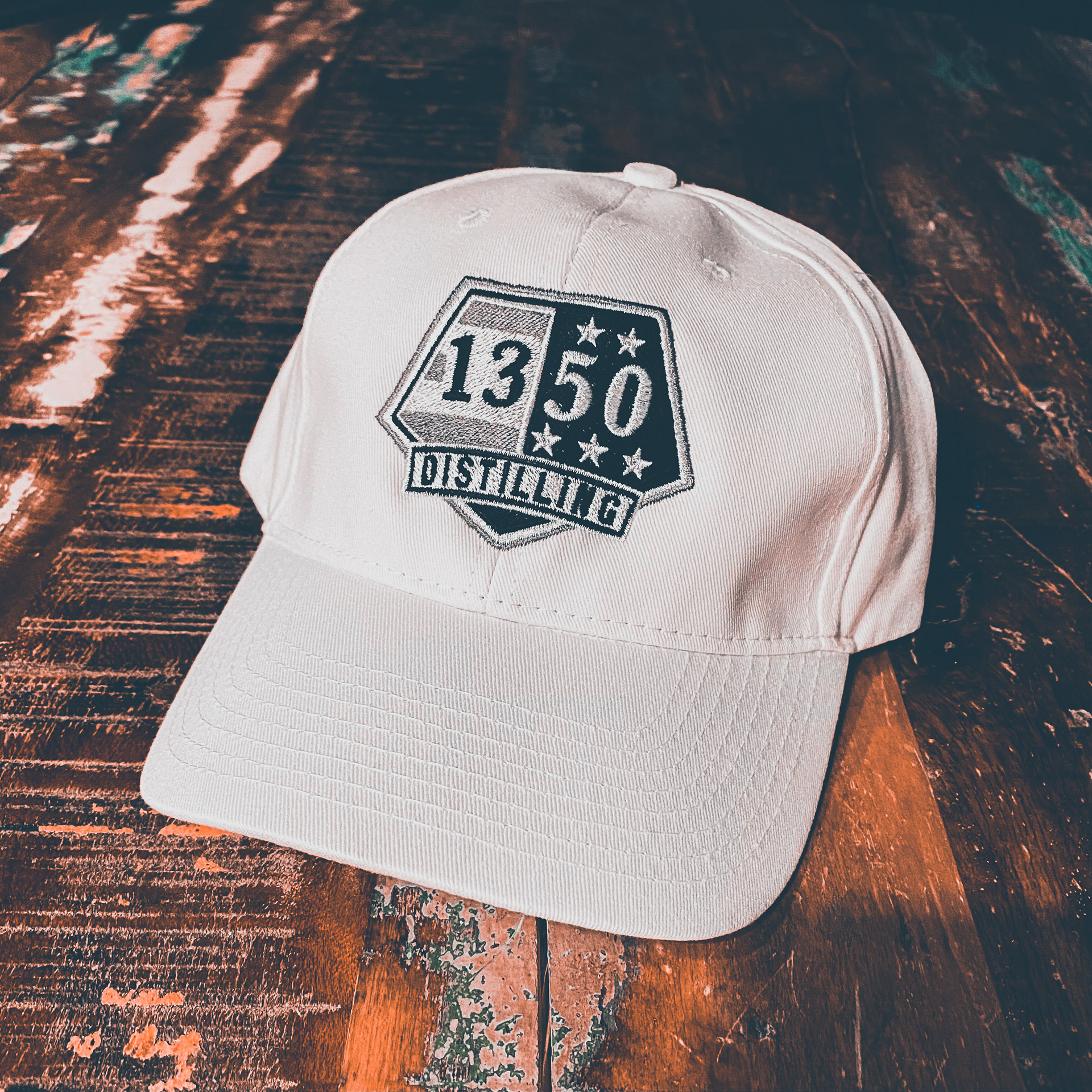
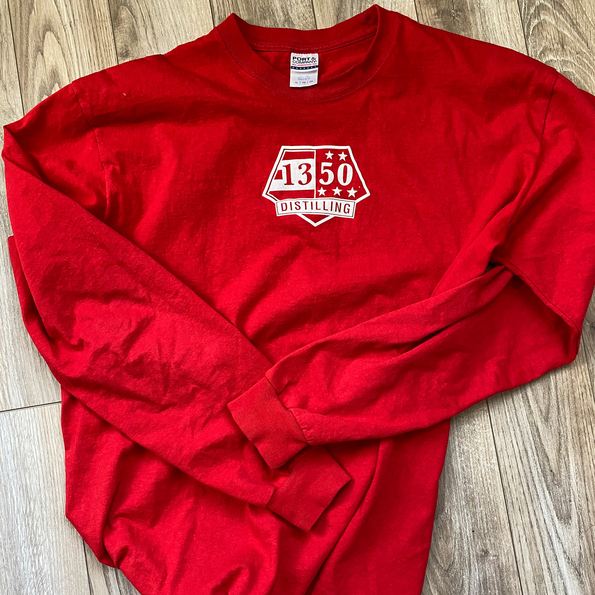
Merchandise
Merchandise and products